The first thing you want to do is create a new file. Open Photoshop and click File then New. From here, a dialogue box will pop up asking you to enter the name of the file, the dimensions, and the background color. For this project and demonstration purposes, I chose to make the width 500 px and the height 200 px, though you can choose a different size to work with (and it's best to use smaller button sizes). I also chose to make the background transparent so the edges around the button won't show up against website backgrounds.
Since we're creating a button from scratch, go to the rounded rectangle shape tool in the Tools panel on the left side of the workspace. Another shape might be selected; if so, click the black arrow at the corner of the shape and choose the rounded rectangle shape tool from the list of options.

You may choose any color you want from the color picker, but for now, I've left mine white (since we're going to be adding a gradient anyway). If you'd rather use a solid color, you can choose your color now. Once you've chosen your color, drag the outline of the shape to create the size and shape of the button.

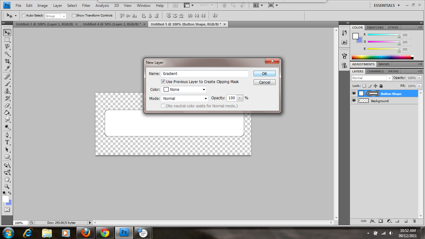
Now that you have your button created, you want to create a new layer for the gradient. Click on Layer along the top bar and then hover over New. Click on Layer to create a new layer.

A dialogue box will pop up asking you to name the layer and choose other options. You can leave the default Layer 2, or you can name it as I did in order to keep your layers neatly labeled. This makes it easier to choose the right one to edit. You should also select the checkbox next to Use Previous layer to Create Clipping Mask. The clipping mask allows you to fill the shape area with a new color or gradient without filling the entire screen.
Next, you want to navigate to the Tools panel and click on the arrow at the corner of the paint bucket tool in order to show more options. You can find the gradient tool in the list and select it.

Here, click on the foreground color swatch on the Tools panel and use the color picker to choose your color. You can eyeball it or type in a hexadecimal number. Once you have chosen your foreground color, you can do the same for the background color (or leave it white) to create your gradient colors. In this case, I've chosen a vibrant yellow-orange for my foreground color and a lighter yellow-orange for my background color.

At this point, I should point out that Photoshop's linear gradient puts the darker color at the top. If you want your lighter color at the top (as I do here), you can always choose the lighter color for the foreground and the darker for the background, or you can do what I did and click the Reverse checkbox along the top bar when the gradient tool is selected. You can see it in the screenshot next to the opacity drop down:

Now drag the gradient tool down to create your gradient. Here, we want to style our button a little bit so it won't look so flat. To bring some dimension to it, we want to add some layer styles. Go to the bottom of the Layers panel on the right side of the workspace and click on fx. From there, you can choose any default style you want, but we want to customize our options, so click Blending Options.

The first thing we want to add is a drop shadow to make the button look like it has body. Click on Drop Shadow to pull up the options. I've left the default except for the size and distance, which means that I changed how far the shadow comes from the shape. I made both bigger to further enhance the effect.

I already know what I want to do, so I'm going to go ahead and add an Inner Shadow so the button's outline will be subtly emphasized. The only thing I changed here was the opacity, which I lowered to 15% to give it a softer, subtler appearance. You don't want your inner shadow to be too strong, or it will give it a harsh, chiseled effect.

Next, we're going to add an inner glow as well. This will also emphasize the outline and create a nice rounding effect once we're finished adding styles. You can customize any of the options you'd like, but the only thing I changed was the color (to white).

This is a personal preference, but I like to add a Bevel and Emboss effect to my buttons to give them a more 3D look. It also makes them look more rounded and glossier. Here, I've left the default of an inner bevel, but I have changed the size to 1 px to make it subtler, and I've changed the softness to 10 px to make it more rounded.

Finally, we're going to add a stroke to define the edges and make them look neat and clean. I've chosen to change the thickness to 1 px so it's effective but subtle. I've also changed the color to a darker orange in order to define the edges while still blending in.

Now that the styles are added, it's time to add the gloss. In order to do this, you want to create a new layer by clicking on Layer + New + Layer in the top bar. You can also click the second to last icon (that looks like a notepad) in the Layers panel on the right side of the workspace. Once your new layer is created and named, press Ctrl while clicking the shape of your button layer. Make sure your pointer is over the shape thumbnail instead of the blank thumbnail or the name of the layer. This will ensure that you select the shape of the button instead of the whole layer. You should see the “marching ants” marquee appear around the shape.

Go to the Tools panel and click on the black arrow beside the gradient tool, then select the paint bucket tool. From the color picker in the Tools panel, choose white or type in FFFFFF in the hexadecimal box. Click anywhere in the selection to fill the button.

In this case, we want our gloss to have a clean edge. If you were working with an elliptical button, you could use a different path shape. For this project, select the rectangular marquee tool and drag the box where you want the darker color to be. In this case, I want my gloss to be at the top of the button, so I make my selection on the lower half. Then press Delete to delete the selection.

Now, we need to adjust the opacity of the layer so the white strip will blend in with the color while still looking like a glossy overlay. In order to do this, go to the Layers panel. Beside the Layer type drop down box, you will see a drop down for opacity. Type in the value you want or move the slider down to lower the opacity and make the layer translucent. Here, I'll point out that lighter colors usually require more opacity than darker ones. When creating this same button in blue, I had to lower the opacity to around 10-15%. However, since this is a lighter color, I went with 20%. Whatever number you choose, remember that the higher the opacity, the higher the contrast.

Next, we're going to create a text layer to prompt users. Click on the text tool in the Tools panel and choose your font, font style, font weight, and color. I chose Arial in black, and left the other default settings.
Once you've dragged the text box where you want your text and have typed it in, you can leave it as is or style it. I've chosen to style it to make it look a little nicer. In order to do this, go to the Layers panel and click on fx at the bottom. Click on Blending Options and choose how you want to style your text. In this case, I've decided to give it an emboss to make it look more defined and sink into the button, so I've selected Bevel and Emboss and chosen the Pillow Emboss from the drop down. I didn't like how the contour gloss looked, so I clicked on the drop down and tried different contours until I found one that suited me. The good thing about the Blending Options dialogue box is that it allows you to preview the changes in the workspace before applying them, so if you don't like the way something looks, all you have to do is hit Cancel.

Our canvas is a little too big for the button, so we need to crop it now. If you already knew what size you needed to make your button and made the canvas accordingly, you can skip this step. Otherwise, select the crop tool on the Tools panel and drag the box around the area you want to keep. Then you can click the check mark or hit Enter.
Now we're ready to save our button. You can save it in any file format you like, but it's best to save it in a format that's suitable for web rendition. Click on File and select Save for Web & Devices. The Save for Web & Devices dialogue box will pop up with more options. I've selected to save the file as a PNG-24 in order to retain my transparent background. Once you choose your options, click Save and name your file, then navigate to the folder you want to save it in, and you're done.
Creating buttons may seem tricky at first, but once you get the hang of it you'll be breezing through it in no time. The best part about using programs like Photoshop is that once you create your base button, you can make as many as you need for your website simply by changing the text. Using Photoshop is a great way of customizing buttons for your website colors and design; it's a lot better than downloading a ready made button off the Internet because it allows you more control. The possibilities are endless once you get the hang of the Adobe Suite.
About CODANK Web Design
CODANK is a top rated Web Design and Internet Marketing firm located in Charlotte, NC. We are dedicated to providing the highest quality, cost effective custom software development services, delivering a broad range of business consulting and outsourcing services.
For more information, visit us at www.codank.com

Explore your options and test different filters and settings. I settled on using the Angled Strokes filter under the Brush Strokes category.charlotte seo firm
ReplyDelete