Friday, September 30, 2011

Creating a navigation bar using Photoshop CS4

Although navigation bars can be created using CSS and CSS3, many designers opt to use an image for the navigation bar because it allows them more control during the design process and is easier to do. With tools such as Adobe Fireworks and Adobe Photoshop, it has become increasingly easier to create navigation bars and other elements using visual tools instead of coding. In this tutorial, we'll look at how to create a slick, sophisticated looking navigation bar using Adobe Photoshop CS4.

First, open Photoshop and create a new document by clicking File and then New. A dialogue box will pop up asking you to define the dimensions and background color. Enter the width you'd like your navigation bar to be (I've made mine 600 px for demonstration purposes). Then make the height a little more than you want your bar to be, to give you room to add drop shadows and see what you're doing (I've made mine 200 px). For now, let's leave the background transparent. When editing the document, you can always add a fill layer of color or black so you can better see the edges while you work.

The first thing we're going to do is create our navigation bar. You can use the rectangle shape tool, but I'm going to use a rectangular marquee so I can specify the exact size. Select the rectangular marquee tool; it may be hidden under another tool, in which case you can click the small black arrow at the corner of the marquee tool button to get a list of options. Once you have the tool selected, go to the top bar and click the drop down box for Style. Choose Fixed Size and type the values in the width and height boxes next to the drop down.

Photobucket

Click anywhere on the screen. By this point, you should have a box that looks a little something like this:

Photobucket

You can fill your navigation bar with any color or gradient you'd like. I've chosen to use the gradient tool for mine, and have used the color picker (the color swatches at the bottom of the Tools panel) to choose a foreground color of #000000 and a background color of #333333 (with the reverse checkbox selected along the top bar). You can find the gradient tool under the paint bucket tool by clicking the black arrow in the corner of the button. Now drag the gradient tool down inside the selection.

Photobucket

We need to add a stroke around the selection to define the edges and give it a nice, crisp feeling. Navigate to the bottom of the Layers panel on the right side of the workspace and click the fx. Go up to Blending Options and click on it.

Photobucket

For the stroke, I chose to give it a thin line of 1 px and change the color to #464646. This way, the edges are defined without the stroke being overbearing.

Photobucket

Now we're going to add a glossy overlay to give it a more sophisticated appearance and more body, so we need to set the rectangular marquee tool back to its original setting. To do this, select the tool then click on the Style drop down box and select Normal.

Photobucket

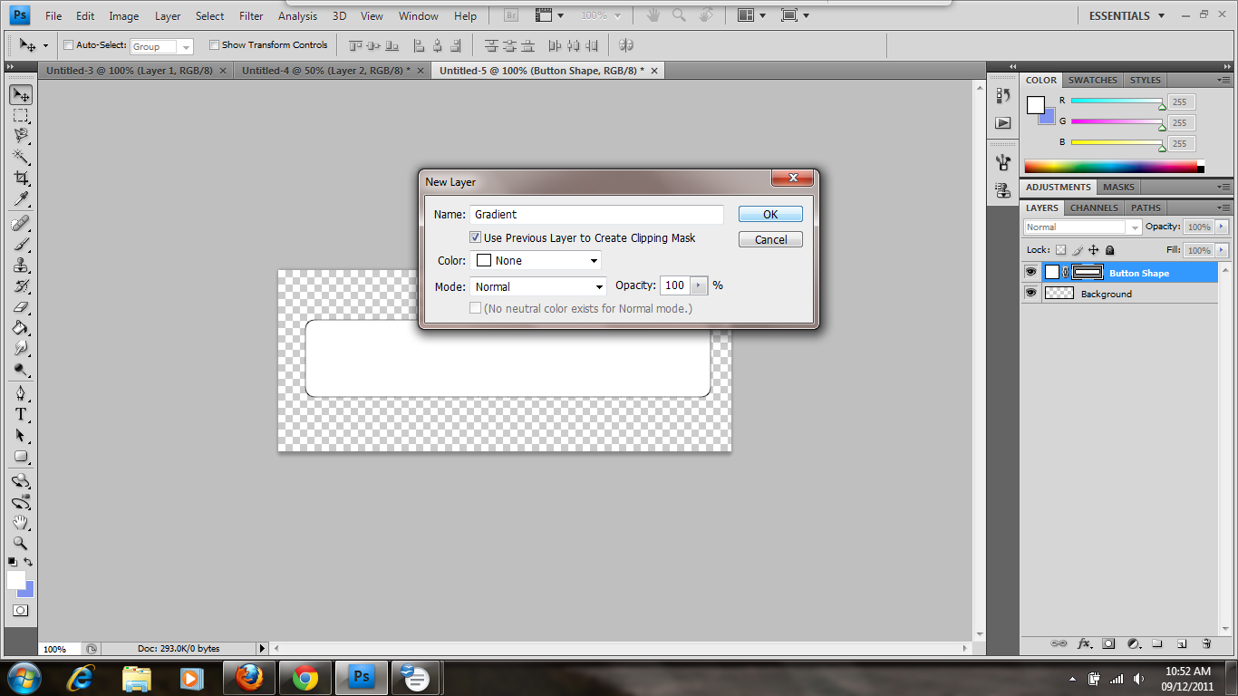
It's time to create a new layer. To do so, click on Layer then New and then Layer. A dialogue box will pop up asking you to name your layer and choose any additional options. I've named my layer to keep it separate from the others.

Photobucket

Now drag the marquee over the top half of the box and fill it with white using the paint bucket tool. You'll find it under the gradient tool if you click the black arrow at the corner. To change the foreground color, click on the color swatch at the bottom of the Tools panel to open the color picker and choose your color.

Photobucket

Now we need to lower the opacity to give it that glossy overlay without being overwhelming. On the right side of the workspace at the top of the Layers panel, you'll find a drop down box for opacity. Enter the amount desired or move the slider. I've chosen to make my opacity 5%. This gives it just enough gloss without the bottom edge being too prominent.

Photobucket

It's looking nice and neat so far, but we need dividers between our links to better set them apart. Select the line tool from the Tools panel; it may be hidden under another shape, in which case you should hold down the black arrow at the corner of the button to list more options. Once you've selected the line tool, use the color picker to make the foreground color the same color as your navigation bar stroke; in my case, that would be #464646. Change the weight to 1 px.

Photobucket

Before we start drawing our lines, we want to make sure that we space them an equal distance apart. The way I do this is to display the rulers. Click View then Rulers to display the rulers.

Photobucket

The rulers will display, but there is a problem; the default measurement is in inches and our canvas is measured in pixels. In order to get a more accurate measurement, double click one of the rulers to pull up the options box. Under the Rulers drop down, choose pixels.

Photobucket

Think about how many buttons you want and divide that number by the width of your bar. For example, I want to make three buttons so I perform the following calculation: 600/3. This gives me 200 px for each button. When I move the line tool in the workspace, a subtle dotted line appears at the top of the ruler, and I use this to measure out 200 px between each line. Once you have the tool lined up, press shift while holding the mouse button and dragging it down to make a perfectly straight vertical line. Do this as many times as you need to create the number of buttons you want. After you've made sure your lines are where you want them (and you can adjust them by using the move tool at the top of the tools panel and dragging it or nudging it with the arrow keys), select the path selection tool, which looks like a plain black arrow. Then click the check mark on the top bar.

Photobucket

In order to make the lines look like they're engraved, we need to create a second set of lines in a lighter color; in this case, I've chosen to use #b8b8b8. Use the color picker to select the color you'd like.

Photobucket

It may be a little difficult to see what you're doing since the lines are so thin, so you can use the zoom tool (which looks like a magnifying glass) to zoom in. Draw your lines one or two pixels to the right of the first line, making sure to hold down the shift key while drawing them in order to keep them straight. Once you're satisfied with your lines, click on the path selection tool and then the arrow at the top bar.

Photobucket

Now we want to add a shadow along our lines to make them look more sunken in. In order to do that, we need to create a new layer by clicking Layer + New + Layer. When the dialogue box pops up, you can give it any name you want or leave the default; I've named mine Shadow. Now select the brush tool from the Tools panel. Along the top bar, next to the sample brush dot and size, click the arrow button to reveal more options. Enter a size (I've chosen 30 px) and move the hardness slider down to 0%. This will give it a soft, shadowed edge.

Photobucket

Make a dot on the middle of each of your lines. It should look something like this:

Photobucket

The contrast is a little too noticeable, so we need to bring the opacity down. Navigate to the top of the Layers panel on the right side of the workspace and find the drop down for opacity. Type it in or move the slider; I've chosen to make mine 25%.

Photobucket

In order to perform the next step, we need to group the lines and shadows. To do this, click Layer, then New, then Group. When the dialogue box pops up, you can choose the options and a name or leave the default.

Photobucket

Select the shadow and line layers by holding down Ctrl while clicking on them. Then drag and drop them into the group layer.

Photobucket

Now we need to create a layer mask. To do this, make sure the Group layer is selected and click on the third icon, next to the fx.

Photobucket

Select the brush tool from the tools panel and click the drop down box next to the dot and size sample. Move the hardness slider back to 100% and make the size of the brush tip smaller. I've chosen to make mine 10 px. Then use the color picker to make your brush color black.

Photobucket

Move the brush along the top and bottom edges of your lines. As you brush, you'll notice that the line and shadow disappears. You don't want to take a lot off—just enough to make the lines less intrusive and disruptive.

Photobucket

Our bar's design is mostly finished, but we need to add some text. Select the text tool from the Tools panel and use the drop down along the top bar to pick a font. You can also pick a font weight, a font size, and a font color. I've chosen 18 px Arial in white.

Photobucket

Drag a text box or click in the button area, then start typing. You can specify the alignment by using the buttons along the top bar; I've chosen to center it. You can also use the move tool at the top of the tools panel to drag or nudge your text until you're satisfied with the placement. Finish typing the names of your links and align them using the move tool and the rulers. It should be uniform and consistent. It should look something like this:

Photobucket

At this point, you can crop some of the extra white space out using the crop tool. Just drag a box around the area you want to keep and hit Enter.

Now it's time to save the file. Click File then Save for Web & Devices since we want to put this on a web page. This will ensure the file is optimized for loading. When the dialogue box pops up, choose PNG-24 from the drop down so the transparent edges won't be visible against a web page background. Click Save then name it and navigate to the folder you want to save in.

Using Photoshop is a great way to create navigation bars, buttons, and more for your web page. Just remember that the more images your page has, the longer it'll take to load. If you're careful, though, using one or two elements created in Photoshop won't hurt and will make your site look nice and sleek.


About CODANK Web Design


CODANK is a top rated Web Design and Internet Marketing firm located in Charlotte, NC. We are dedicated to providing the highest quality, cost effective custom software development services, delivering a broad range of business consulting and outsourcing services.


For more information, visit us at www.codank.com

Tuesday, September 27, 2011

Creating Vignette Photo Effects in Photoshop CS4

Editing a photo to make it look professional and studio-quality can be time consuming. Although there are many things you can do to touch your photos up, a quick and easy way of giving a picture that studio feel is to add a vignette. In this tutorial, we'll look at how to customize and add a vignette using Adobe Photoshop CS4.

Open Photoshop and click File and Open. Then navigate to the folder where you saved your file and open it.

Once you've opened your photograph file, navigate to the Layers panel on the right side of the workspace and right click the background layer. Choose Layer from Background and, if desired, enter a name for the layer when prompted.


Next, you want to create a new fill layer. Navigate to the bottom of the Layers panel and click the middle icon; it looks like a circle that's half black and half white. You can choose any background you want, whether it's a gradient, a solid color, or a pattern. In this demonstration, we're going to choose a solid color.


The layer will be created and the color picker dialogue box will automatically pop up. Choose the color you want the background of your picture to be. In this case, I've chosen white (to start).


Now, make sure your new fill layer is still active and then select the elliptical marquee tool. It may be underneath the rectangular marquee tool, in which case you should click on the black arrow in the corner of the tool button to pull up the list of options. If you want your selection to have a soft, faded out effect, then change the Feather option along the top bar. I've chosen to feather my edges by 50 px to give it a gradual, soft fading out. Drag a selection marquee around the area that you want to be visible.


Now we want the picture to be visible through the selected area, so we click Edit and then Fill.


Since the layer color is white, you want to choose the opposite of that so the selection will be visible. In the color drop down box, choose black and then click OK.


Your selection should appear. At this point, you want to deselect the image, so click Select then Deselect.

Here, I should mention that if you change your mind about the background color, you can always change it by double clicking on the first thumbnail of your fill layer. You can choose a color from the color picker and it will automatically replace the old one. I decided I wanted a different color that blended in a little more, so I used the color picker and the eyedropper tool to select a color from the man's shirt to use for the background.

Now let's do some cropping to get rid of the extra space. You always want to leave some space to frame the image, but too much will make it look off balance and isolated. Select the crop tool from the Tools panel and drag the box around the area you want to keep. Then hit Enter.


Your picture is ready to save now. You can save it in any format you want, but it's best to save it in a format that's suitable for the web. To do this, click on File then Save for Web & Devices.

When the dialogue box pops up, select the options that suite you. I have chosen to save it as a JPEG since it's a photograph. Once you're done setting options, click Save and give it a name, then navigate to the folder where you want to save it.

Creating vignettes is a simple, easy way of emphasizing a focal point of your pictures or making them look more professional.


About CODANK Web Design

CODANK is a top rated Web Design and Internet Marketing firm located in Charlotte, NC. We are dedicated to providing the highest quality, cost effective custom software development services, delivering a broad range of business consulting and outsourcing services.

For more information, visit us at www.codank.com

Friday, September 23, 2011

Creating a button with gloss in Adobe Photoshop CS4

You may have visited websites and wondered how they created those nice, glossy buttons. Although it may seem difficult to create, once you see how it's done you'll realize how easy it is to create glossy, professional looking buttons. In this tutorial, we will look at how you can easily create a button with a glossy finish in Adobe Photoshop CS4.

The first thing you want to do is create a new file. Open Photoshop and click File then New. From here, a dialogue box will pop up asking you to enter the name of the file, the dimensions, and the background color. For this project and demonstration purposes, I chose to make the width 500 px and the height 200 px, though you can choose a different size to work with (and it's best to use smaller button sizes). I also chose to make the background transparent so the edges around the button won't show up against website backgrounds.

Since we're creating a button from scratch, go to the rounded rectangle shape tool in the Tools panel on the left side of the workspace. Another shape might be selected; if so, click the black arrow at the corner of the shape and choose the rounded rectangle shape tool from the list of options.


You may choose any color you want from the color picker, but for now, I've left mine white (since we're going to be adding a gradient anyway). If you'd rather use a solid color, you can choose your color now. Once you've chosen your color, drag the outline of the shape to create the size and shape of the button.


Now that you have your button created, you want to create a new layer for the gradient. Click on Layer along the top bar and then hover over New. Click on Layer to create a new layer.


A dialogue box will pop up asking you to name the layer and choose other options. You can leave the default Layer 2, or you can name it as I did in order to keep your layers neatly labeled. This makes it easier to choose the right one to edit. You should also select the checkbox next to Use Previous layer to Create Clipping Mask. The clipping mask allows you to fill the shape area with a new color or gradient without filling the entire screen.


Next, you want to navigate to the Tools panel and click on the arrow at the corner of the paint bucket tool in order to show more options. You can find the gradient tool in the list and select it.


Here, click on the foreground color swatch on the Tools panel and use the color picker to choose your color. You can eyeball it or type in a hexadecimal number. Once you have chosen your foreground color, you can do the same for the background color (or leave it white) to create your gradient colors. In this case, I've chosen a vibrant yellow-orange for my foreground color and a lighter yellow-orange for my background color.


At this point, I should point out that Photoshop's linear gradient puts the darker color at the top. If you want your lighter color at the top (as I do here), you can always choose the lighter color for the foreground and the darker for the background, or you can do what I did and click the Reverse checkbox along the top bar when the gradient tool is selected. You can see it in the screenshot next to the opacity drop down:


Now drag the gradient tool down to create your gradient. Here, we want to style our button a little bit so it won't look so flat. To bring some dimension to it, we want to add some layer styles. Go to the bottom of the Layers panel on the right side of the workspace and click on fx. From there, you can choose any default style you want, but we want to customize our options, so click Blending Options.


The first thing we want to add is a drop shadow to make the button look like it has body. Click on Drop Shadow to pull up the options. I've left the default except for the size and distance, which means that I changed how far the shadow comes from the shape. I made both bigger to further enhance the effect.


I already know what I want to do, so I'm going to go ahead and add an Inner Shadow so the button's outline will be subtly emphasized. The only thing I changed here was the opacity, which I lowered to 15% to give it a softer, subtler appearance. You don't want your inner shadow to be too strong, or it will give it a harsh, chiseled effect.


Next, we're going to add an inner glow as well. This will also emphasize the outline and create a nice rounding effect once we're finished adding styles. You can customize any of the options you'd like, but the only thing I changed was the color (to white).


This is a personal preference, but I like to add a Bevel and Emboss effect to my buttons to give them a more 3D look. It also makes them look more rounded and glossier. Here, I've left the default of an inner bevel, but I have changed the size to 1 px to make it subtler, and I've changed the softness to 10 px to make it more rounded.


Finally, we're going to add a stroke to define the edges and make them look neat and clean. I've chosen to change the thickness to 1 px so it's effective but subtle. I've also changed the color to a darker orange in order to define the edges while still blending in.


Now that the styles are added, it's time to add the gloss. In order to do this, you want to create a new layer by clicking on Layer + New + Layer in the top bar. You can also click the second to last icon (that looks like a notepad) in the Layers panel on the right side of the workspace. Once your new layer is created and named, press Ctrl while clicking the shape of your button layer. Make sure your pointer is over the shape thumbnail instead of the blank thumbnail or the name of the layer. This will ensure that you select the shape of the button instead of the whole layer. You should see the “marching ants” marquee appear around the shape.


Go to the Tools panel and click on the black arrow beside the gradient tool, then select the paint bucket tool. From the color picker in the Tools panel, choose white or type in FFFFFF in the hexadecimal box. Click anywhere in the selection to fill the button.


In this case, we want our gloss to have a clean edge. If you were working with an elliptical button, you could use a different path shape. For this project, select the rectangular marquee tool and drag the box where you want the darker color to be. In this case, I want my gloss to be at the top of the button, so I make my selection on the lower half. Then press Delete to delete the selection.


Now, we need to adjust the opacity of the layer so the white strip will blend in with the color while still looking like a glossy overlay. In order to do this, go to the Layers panel. Beside the Layer type drop down box, you will see a drop down for opacity. Type in the value you want or move the slider down to lower the opacity and make the layer translucent. Here, I'll point out that lighter colors usually require more opacity than darker ones. When creating this same button in blue, I had to lower the opacity to around 10-15%. However, since this is a lighter color, I went with 20%. Whatever number you choose, remember that the higher the opacity, the higher the contrast.


Next, we're going to create a text layer to prompt users. Click on the text tool in the Tools panel and choose your font, font style, font weight, and color. I chose Arial in black, and left the other default settings.

Once you've dragged the text box where you want your text and have typed it in, you can leave it as is or style it. I've chosen to style it to make it look a little nicer. In order to do this, go to the Layers panel and click on fx at the bottom. Click on Blending Options and choose how you want to style your text. In this case, I've decided to give it an emboss to make it look more defined and sink into the button, so I've selected Bevel and Emboss and chosen the Pillow Emboss from the drop down. I didn't like how the contour gloss looked, so I clicked on the drop down and tried different contours until I found one that suited me. The good thing about the Blending Options dialogue box is that it allows you to preview the changes in the workspace before applying them, so if you don't like the way something looks, all you have to do is hit Cancel.


Our canvas is a little too big for the button, so we need to crop it now. If you already knew what size you needed to make your button and made the canvas accordingly, you can skip this step. Otherwise, select the crop tool on the Tools panel and drag the box around the area you want to keep. Then you can click the check mark or hit Enter.

Now we're ready to save our button. You can save it in any file format you like, but it's best to save it in a format that's suitable for web rendition. Click on File and select Save for Web & Devices. The Save for Web & Devices dialogue box will pop up with more options. I've selected to save the file as a PNG-24 in order to retain my transparent background. Once you choose your options, click Save and name your file, then navigate to the folder you want to save it in, and you're done.

Creating buttons may seem tricky at first, but once you get the hang of it you'll be breezing through it in no time. The best part about using programs like Photoshop is that once you create your base button, you can make as many as you need for your website simply by changing the text. Using Photoshop is a great way of customizing buttons for your website colors and design; it's a lot better than downloading a ready made button off the Internet because it allows you more control. The possibilities are endless once you get the hang of the Adobe Suite.

About CODANK Web Design

CODANK is a top rated Web Design and Internet Marketing firm located in Charlotte, NC. We are dedicated to providing the highest quality, cost effective custom software development services, delivering a broad range of business consulting and outsourcing services.

For more information, visit us at www.codank.com