Creating or finding images for your website is the hard part; once you're finished, all you have to do is save it and you're done. However, saving your images in the right format might not be something that crossed your mind. Even if it doesn't seem like a big deal, it's important to choose the right format so the picture will render on the web page properly - and in the least amount of time possible.
GIF is best used for diagrams, graphical elements such as frames and backgrounds, and some animations. It is frequently used by designers because it is supported by every browser and platform, meaning that it will render properly no matter what you use to view the web page. Another good thing about saving an image as a GIF is that they can have transparent backgrounds, which means that an image like a logo can have the same color background as the web page. Additionally, GIF images are smaller files and load faster, making them ideal for web use.
JPEG is best used for photographs and detailed illustrations because it supports 24 bit color, whereas GIF only supports 8 bit (which is only 256 colors). Therefore, JPEG is able to better capture and recreate in photographs what is seen in real life. Another benefit of JPEG is that it is better for quality images with faster download times. However, it shouldn't be used for graphical elements, as they might not render properly.
PNG is best used for diagrams and graphical elements; it will be a replacement for GIF. The good thing about PNG images is that they provide the same 24 bit color support that JPEG does while also providing benefits of GIF images, such as transparency and interlacing (which means that the image will appear before it's finished loading because the odd lines will load first, followed by the even ones). Another good thing about PNG is that is allows you to have a text description for your image, which is better for search engine optimization because you can use the description to add more keywords. PNG isn't used as much yet simply because it's not as widely supported as GIF.
For now, it might be best to save your images in GIF and JPEG formats, though PNG should catch up soon. If you still have doubt about what you should save your images as, you can talk to your web designer or web design company to find out what they need.
About CODANK Web Design
CODANK is a top rated Web Design and Internet Marketing firm located in Charlotte, NC. We are dedicated to providing the highest quality, cost effective custom software development services, delivering a broad range of business consulting and outsourcing services.
For more information, visit us at www.codank.com
Showing posts with label Graphics. Show all posts
Showing posts with label Graphics. Show all posts
Monday, December 5, 2011


Friday, September 30, 2011
Creating a navigation bar using Photoshop CS4
Although navigation bars can be created using CSS and CSS3, many designers opt to use an image for the navigation bar because it allows them more control during the design process and is easier to do. With tools such as Adobe Fireworks and Adobe Photoshop, it has become increasingly easier to create navigation bars and other elements using visual tools instead of coding. In this tutorial, we'll look at how to create a slick, sophisticated looking navigation bar using Adobe Photoshop CS4.
First, open Photoshop and create a new document by clicking File and then New. A dialogue box will pop up asking you to define the dimensions and background color. Enter the width you'd like your navigation bar to be (I've made mine 600 px for demonstration purposes). Then make the height a little more than you want your bar to be, to give you room to add drop shadows and see what you're doing (I've made mine 200 px). For now, let's leave the background transparent. When editing the document, you can always add a fill layer of color or black so you can better see the edges while you work.
The first thing we're going to do is create our navigation bar. You can use the rectangle shape tool, but I'm going to use a rectangular marquee so I can specify the exact size. Select the rectangular marquee tool; it may be hidden under another tool, in which case you can click the small black arrow at the corner of the marquee tool button to get a list of options. Once you have the tool selected, go to the top bar and click the drop down box for Style. Choose Fixed Size and type the values in the width and height boxes next to the drop down.

Click anywhere on the screen. By this point, you should have a box that looks a little something like this:

You can fill your navigation bar with any color or gradient you'd like. I've chosen to use the gradient tool for mine, and have used the color picker (the color swatches at the bottom of the Tools panel) to choose a foreground color of #000000 and a background color of #333333 (with the reverse checkbox selected along the top bar). You can find the gradient tool under the paint bucket tool by clicking the black arrow in the corner of the button. Now drag the gradient tool down inside the selection.

We need to add a stroke around the selection to define the edges and give it a nice, crisp feeling. Navigate to the bottom of the Layers panel on the right side of the workspace and click the fx. Go up to Blending Options and click on it.

For the stroke, I chose to give it a thin line of 1 px and change the color to #464646. This way, the edges are defined without the stroke being overbearing.

Now we're going to add a glossy overlay to give it a more sophisticated appearance and more body, so we need to set the rectangular marquee tool back to its original setting. To do this, select the tool then click on the Style drop down box and select Normal.

It's time to create a new layer. To do so, click on Layer then New and then Layer. A dialogue box will pop up asking you to name your layer and choose any additional options. I've named my layer to keep it separate from the others.

Now drag the marquee over the top half of the box and fill it with white using the paint bucket tool. You'll find it under the gradient tool if you click the black arrow at the corner. To change the foreground color, click on the color swatch at the bottom of the Tools panel to open the color picker and choose your color.

Now we need to lower the opacity to give it that glossy overlay without being overwhelming. On the right side of the workspace at the top of the Layers panel, you'll find a drop down box for opacity. Enter the amount desired or move the slider. I've chosen to make my opacity 5%. This gives it just enough gloss without the bottom edge being too prominent.

It's looking nice and neat so far, but we need dividers between our links to better set them apart. Select the line tool from the Tools panel; it may be hidden under another shape, in which case you should hold down the black arrow at the corner of the button to list more options. Once you've selected the line tool, use the color picker to make the foreground color the same color as your navigation bar stroke; in my case, that would be #464646. Change the weight to 1 px.

Before we start drawing our lines, we want to make sure that we space them an equal distance apart. The way I do this is to display the rulers. Click View then Rulers to display the rulers.

The rulers will display, but there is a problem; the default measurement is in inches and our canvas is measured in pixels. In order to get a more accurate measurement, double click one of the rulers to pull up the options box. Under the Rulers drop down, choose pixels.

Think about how many buttons you want and divide that number by the width of your bar. For example, I want to make three buttons so I perform the following calculation: 600/3. This gives me 200 px for each button. When I move the line tool in the workspace, a subtle dotted line appears at the top of the ruler, and I use this to measure out 200 px between each line. Once you have the tool lined up, press shift while holding the mouse button and dragging it down to make a perfectly straight vertical line. Do this as many times as you need to create the number of buttons you want. After you've made sure your lines are where you want them (and you can adjust them by using the move tool at the top of the tools panel and dragging it or nudging it with the arrow keys), select the path selection tool, which looks like a plain black arrow. Then click the check mark on the top bar.

In order to make the lines look like they're engraved, we need to create a second set of lines in a lighter color; in this case, I've chosen to use #b8b8b8. Use the color picker to select the color you'd like.

It may be a little difficult to see what you're doing since the lines are so thin, so you can use the zoom tool (which looks like a magnifying glass) to zoom in. Draw your lines one or two pixels to the right of the first line, making sure to hold down the shift key while drawing them in order to keep them straight. Once you're satisfied with your lines, click on the path selection tool and then the arrow at the top bar.

Now we want to add a shadow along our lines to make them look more sunken in. In order to do that, we need to create a new layer by clicking Layer + New + Layer. When the dialogue box pops up, you can give it any name you want or leave the default; I've named mine Shadow. Now select the brush tool from the Tools panel. Along the top bar, next to the sample brush dot and size, click the arrow button to reveal more options. Enter a size (I've chosen 30 px) and move the hardness slider down to 0%. This will give it a soft, shadowed edge.

Make a dot on the middle of each of your lines. It should look something like this:

The contrast is a little too noticeable, so we need to bring the opacity down. Navigate to the top of the Layers panel on the right side of the workspace and find the drop down for opacity. Type it in or move the slider; I've chosen to make mine 25%.

In order to perform the next step, we need to group the lines and shadows. To do this, click Layer, then New, then Group. When the dialogue box pops up, you can choose the options and a name or leave the default.

Select the shadow and line layers by holding down Ctrl while clicking on them. Then drag and drop them into the group layer.

Now we need to create a layer mask. To do this, make sure the Group layer is selected and click on the third icon, next to the fx.

Select the brush tool from the tools panel and click the drop down box next to the dot and size sample. Move the hardness slider back to 100% and make the size of the brush tip smaller. I've chosen to make mine 10 px. Then use the color picker to make your brush color black.

Move the brush along the top and bottom edges of your lines. As you brush, you'll notice that the line and shadow disappears. You don't want to take a lot off—just enough to make the lines less intrusive and disruptive.

Our bar's design is mostly finished, but we need to add some text. Select the text tool from the Tools panel and use the drop down along the top bar to pick a font. You can also pick a font weight, a font size, and a font color. I've chosen 18 px Arial in white.

Drag a text box or click in the button area, then start typing. You can specify the alignment by using the buttons along the top bar; I've chosen to center it. You can also use the move tool at the top of the tools panel to drag or nudge your text until you're satisfied with the placement. Finish typing the names of your links and align them using the move tool and the rulers. It should be uniform and consistent. It should look something like this:

At this point, you can crop some of the extra white space out using the crop tool. Just drag a box around the area you want to keep and hit Enter.
Now it's time to save the file. Click File then Save for Web & Devices since we want to put this on a web page. This will ensure the file is optimized for loading. When the dialogue box pops up, choose PNG-24 from the drop down so the transparent edges won't be visible against a web page background. Click Save then name it and navigate to the folder you want to save in.
Using Photoshop is a great way to create navigation bars, buttons, and more for your web page. Just remember that the more images your page has, the longer it'll take to load. If you're careful, though, using one or two elements created in Photoshop won't hurt and will make your site look nice and sleek.
First, open Photoshop and create a new document by clicking File and then New. A dialogue box will pop up asking you to define the dimensions and background color. Enter the width you'd like your navigation bar to be (I've made mine 600 px for demonstration purposes). Then make the height a little more than you want your bar to be, to give you room to add drop shadows and see what you're doing (I've made mine 200 px). For now, let's leave the background transparent. When editing the document, you can always add a fill layer of color or black so you can better see the edges while you work.
The first thing we're going to do is create our navigation bar. You can use the rectangle shape tool, but I'm going to use a rectangular marquee so I can specify the exact size. Select the rectangular marquee tool; it may be hidden under another tool, in which case you can click the small black arrow at the corner of the marquee tool button to get a list of options. Once you have the tool selected, go to the top bar and click the drop down box for Style. Choose Fixed Size and type the values in the width and height boxes next to the drop down.

Click anywhere on the screen. By this point, you should have a box that looks a little something like this:

You can fill your navigation bar with any color or gradient you'd like. I've chosen to use the gradient tool for mine, and have used the color picker (the color swatches at the bottom of the Tools panel) to choose a foreground color of #000000 and a background color of #333333 (with the reverse checkbox selected along the top bar). You can find the gradient tool under the paint bucket tool by clicking the black arrow in the corner of the button. Now drag the gradient tool down inside the selection.

We need to add a stroke around the selection to define the edges and give it a nice, crisp feeling. Navigate to the bottom of the Layers panel on the right side of the workspace and click the fx. Go up to Blending Options and click on it.

For the stroke, I chose to give it a thin line of 1 px and change the color to #464646. This way, the edges are defined without the stroke being overbearing.

Now we're going to add a glossy overlay to give it a more sophisticated appearance and more body, so we need to set the rectangular marquee tool back to its original setting. To do this, select the tool then click on the Style drop down box and select Normal.

It's time to create a new layer. To do so, click on Layer then New and then Layer. A dialogue box will pop up asking you to name your layer and choose any additional options. I've named my layer to keep it separate from the others.

Now drag the marquee over the top half of the box and fill it with white using the paint bucket tool. You'll find it under the gradient tool if you click the black arrow at the corner. To change the foreground color, click on the color swatch at the bottom of the Tools panel to open the color picker and choose your color.

Now we need to lower the opacity to give it that glossy overlay without being overwhelming. On the right side of the workspace at the top of the Layers panel, you'll find a drop down box for opacity. Enter the amount desired or move the slider. I've chosen to make my opacity 5%. This gives it just enough gloss without the bottom edge being too prominent.

It's looking nice and neat so far, but we need dividers between our links to better set them apart. Select the line tool from the Tools panel; it may be hidden under another shape, in which case you should hold down the black arrow at the corner of the button to list more options. Once you've selected the line tool, use the color picker to make the foreground color the same color as your navigation bar stroke; in my case, that would be #464646. Change the weight to 1 px.

Before we start drawing our lines, we want to make sure that we space them an equal distance apart. The way I do this is to display the rulers. Click View then Rulers to display the rulers.

The rulers will display, but there is a problem; the default measurement is in inches and our canvas is measured in pixels. In order to get a more accurate measurement, double click one of the rulers to pull up the options box. Under the Rulers drop down, choose pixels.

Think about how many buttons you want and divide that number by the width of your bar. For example, I want to make three buttons so I perform the following calculation: 600/3. This gives me 200 px for each button. When I move the line tool in the workspace, a subtle dotted line appears at the top of the ruler, and I use this to measure out 200 px between each line. Once you have the tool lined up, press shift while holding the mouse button and dragging it down to make a perfectly straight vertical line. Do this as many times as you need to create the number of buttons you want. After you've made sure your lines are where you want them (and you can adjust them by using the move tool at the top of the tools panel and dragging it or nudging it with the arrow keys), select the path selection tool, which looks like a plain black arrow. Then click the check mark on the top bar.

In order to make the lines look like they're engraved, we need to create a second set of lines in a lighter color; in this case, I've chosen to use #b8b8b8. Use the color picker to select the color you'd like.

It may be a little difficult to see what you're doing since the lines are so thin, so you can use the zoom tool (which looks like a magnifying glass) to zoom in. Draw your lines one or two pixels to the right of the first line, making sure to hold down the shift key while drawing them in order to keep them straight. Once you're satisfied with your lines, click on the path selection tool and then the arrow at the top bar.

Now we want to add a shadow along our lines to make them look more sunken in. In order to do that, we need to create a new layer by clicking Layer + New + Layer. When the dialogue box pops up, you can give it any name you want or leave the default; I've named mine Shadow. Now select the brush tool from the Tools panel. Along the top bar, next to the sample brush dot and size, click the arrow button to reveal more options. Enter a size (I've chosen 30 px) and move the hardness slider down to 0%. This will give it a soft, shadowed edge.

Make a dot on the middle of each of your lines. It should look something like this:

The contrast is a little too noticeable, so we need to bring the opacity down. Navigate to the top of the Layers panel on the right side of the workspace and find the drop down for opacity. Type it in or move the slider; I've chosen to make mine 25%.

In order to perform the next step, we need to group the lines and shadows. To do this, click Layer, then New, then Group. When the dialogue box pops up, you can choose the options and a name or leave the default.

Select the shadow and line layers by holding down Ctrl while clicking on them. Then drag and drop them into the group layer.

Now we need to create a layer mask. To do this, make sure the Group layer is selected and click on the third icon, next to the fx.

Select the brush tool from the tools panel and click the drop down box next to the dot and size sample. Move the hardness slider back to 100% and make the size of the brush tip smaller. I've chosen to make mine 10 px. Then use the color picker to make your brush color black.

Move the brush along the top and bottom edges of your lines. As you brush, you'll notice that the line and shadow disappears. You don't want to take a lot off—just enough to make the lines less intrusive and disruptive.

Our bar's design is mostly finished, but we need to add some text. Select the text tool from the Tools panel and use the drop down along the top bar to pick a font. You can also pick a font weight, a font size, and a font color. I've chosen 18 px Arial in white.

Drag a text box or click in the button area, then start typing. You can specify the alignment by using the buttons along the top bar; I've chosen to center it. You can also use the move tool at the top of the tools panel to drag or nudge your text until you're satisfied with the placement. Finish typing the names of your links and align them using the move tool and the rulers. It should be uniform and consistent. It should look something like this:

At this point, you can crop some of the extra white space out using the crop tool. Just drag a box around the area you want to keep and hit Enter.
Now it's time to save the file. Click File then Save for Web & Devices since we want to put this on a web page. This will ensure the file is optimized for loading. When the dialogue box pops up, choose PNG-24 from the drop down so the transparent edges won't be visible against a web page background. Click Save then name it and navigate to the folder you want to save in.
Using Photoshop is a great way to create navigation bars, buttons, and more for your web page. Just remember that the more images your page has, the longer it'll take to load. If you're careful, though, using one or two elements created in Photoshop won't hurt and will make your site look nice and sleek.
About CODANK Web Design
CODANK is a top rated Web Design and Internet Marketing firm located in Charlotte, NC. We are dedicated to providing the highest quality, cost effective custom software development services, delivering a broad range of business consulting and outsourcing services.
For more information, visit us at www.codank.com
Tuesday, September 27, 2011
Creating Vignette Photo Effects in Photoshop CS4
Editing a photo to make it look professional and studio-quality can be time consuming. Although there are many things you can do to touch your photos up, a quick and easy way of giving a picture that studio feel is to add a vignette. In this tutorial, we'll look at how to customize and add a vignette using Adobe Photoshop CS4.
Open Photoshop and click File and Open. Then navigate to the folder where you saved your file and open it.
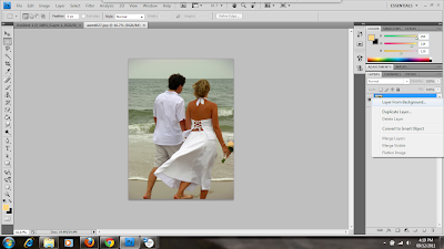
Once you've opened your photograph file, navigate to the Layers panel on the right side of the workspace and right click the background layer. Choose Layer from Background and, if desired, enter a name for the layer when prompted.
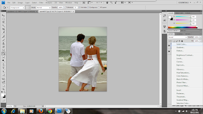
Next, you want to create a new fill layer. Navigate to the bottom of the Layers panel and click the middle icon; it looks like a circle that's half black and half white. You can choose any background you want, whether it's a gradient, a solid color, or a pattern. In this demonstration, we're going to choose a solid color.
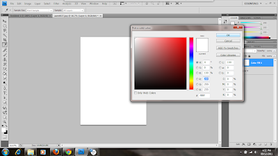
The layer will be created and the color picker dialogue box will automatically pop up. Choose the color you want the background of your picture to be. In this case, I've chosen white (to start).
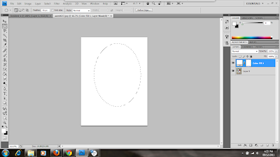
Now, make sure your new fill layer is still active and then select the elliptical marquee tool. It may be underneath the rectangular marquee tool, in which case you should click on the black arrow in the corner of the tool button to pull up the list of options. If you want your selection to have a soft, faded out effect, then change the Feather option along the top bar. I've chosen to feather my edges by 50 px to give it a gradual, soft fading out. Drag a selection marquee around the area that you want to be visible.
Now we want the picture to be visible through the selected area, so we click Edit and then Fill.
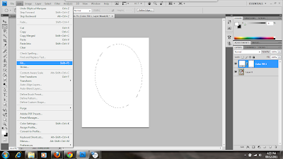
Since the layer color is white, you want to choose the opposite of that so the selection will be visible. In the color drop down box, choose black and then click OK.
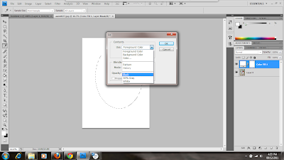
Your selection should appear. At this point, you want to deselect the image, so click Select then Deselect.
Here, I should mention that if you change your mind about the background color, you can always change it by double clicking on the first thumbnail of your fill layer. You can choose a color from the color picker and it will automatically replace the old one. I decided I wanted a different color that blended in a little more, so I used the color picker and the eyedropper tool to select a color from the man's shirt to use for the background.
Now let's do some cropping to get rid of the extra space. You always want to leave some space to frame the image, but too much will make it look off balance and isolated. Select the crop tool from the Tools panel and drag the box around the area you want to keep. Then hit Enter.
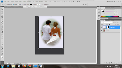
Your picture is ready to save now. You can save it in any format you want, but it's best to save it in a format that's suitable for the web. To do this, click on File then Save for Web & Devices.
When the dialogue box pops up, select the options that suite you. I have chosen to save it as a JPEG since it's a photograph. Once you're done setting options, click Save and give it a name, then navigate to the folder where you want to save it.
Creating vignettes is a simple, easy way of emphasizing a focal point of your pictures or making them look more professional.
About CODANK Web Design
CODANK is a top rated Web Design and Internet Marketing firm located in Charlotte, NC. We are dedicated to providing the highest quality, cost effective custom software development services, delivering a broad range of business consulting and outsourcing services.
For more information, visit us at www.codank.com
Open Photoshop and click File and Open. Then navigate to the folder where you saved your file and open it.
Once you've opened your photograph file, navigate to the Layers panel on the right side of the workspace and right click the background layer. Choose Layer from Background and, if desired, enter a name for the layer when prompted.

Next, you want to create a new fill layer. Navigate to the bottom of the Layers panel and click the middle icon; it looks like a circle that's half black and half white. You can choose any background you want, whether it's a gradient, a solid color, or a pattern. In this demonstration, we're going to choose a solid color.

The layer will be created and the color picker dialogue box will automatically pop up. Choose the color you want the background of your picture to be. In this case, I've chosen white (to start).

Now, make sure your new fill layer is still active and then select the elliptical marquee tool. It may be underneath the rectangular marquee tool, in which case you should click on the black arrow in the corner of the tool button to pull up the list of options. If you want your selection to have a soft, faded out effect, then change the Feather option along the top bar. I've chosen to feather my edges by 50 px to give it a gradual, soft fading out. Drag a selection marquee around the area that you want to be visible.

Now we want the picture to be visible through the selected area, so we click Edit and then Fill.

Since the layer color is white, you want to choose the opposite of that so the selection will be visible. In the color drop down box, choose black and then click OK.

Your selection should appear. At this point, you want to deselect the image, so click Select then Deselect.
Here, I should mention that if you change your mind about the background color, you can always change it by double clicking on the first thumbnail of your fill layer. You can choose a color from the color picker and it will automatically replace the old one. I decided I wanted a different color that blended in a little more, so I used the color picker and the eyedropper tool to select a color from the man's shirt to use for the background.
Now let's do some cropping to get rid of the extra space. You always want to leave some space to frame the image, but too much will make it look off balance and isolated. Select the crop tool from the Tools panel and drag the box around the area you want to keep. Then hit Enter.

Your picture is ready to save now. You can save it in any format you want, but it's best to save it in a format that's suitable for the web. To do this, click on File then Save for Web & Devices.
When the dialogue box pops up, select the options that suite you. I have chosen to save it as a JPEG since it's a photograph. Once you're done setting options, click Save and give it a name, then navigate to the folder where you want to save it.
Creating vignettes is a simple, easy way of emphasizing a focal point of your pictures or making them look more professional.
About CODANK Web Design
CODANK is a top rated Web Design and Internet Marketing firm located in Charlotte, NC. We are dedicated to providing the highest quality, cost effective custom software development services, delivering a broad range of business consulting and outsourcing services.
For more information, visit us at www.codank.com
Wednesday, August 26, 2009
Graphics & Search Engines
Besides frames, scripts, and tables – search engines also have trouble with graphics. From the search engine’s point of view, the only thing that is of any importance on website is the written content (text). Graphics and illustrations are all ignored. A web designer may create a stunning page that appeals to the visitors, but search engines won’t see a bit of it.
When designing a website, consider the importance of matching with content because it is the text-based content that search engines see and use to rank a site. One way to increase the success of graphics it is always good to provide a descriptive tag. The tag should include a site’s keywords and phrases for every graphic on the page. This way search engines will find it possible to read and index information regarding the written content.
Many websites make use of image maps as well as graphics. Image maps also present a problem for search engines. As stated before, the search engine crawlers will not be able to view links which are recognized via an image map and therefore will not be able to locate and index a site’s other pages.
Another valuable consideration is to create a site map (overview of the navigational structure of your website or a file that lists all of the URLs for a website). Submitting a site map to each search engine along with the main page helps to ensure that the engines will be able to locate every page on a website.
About CODANK Web Design
CODANK is a top rated Web Design and Internet Marketing firm located in Charlotte, NC. We are dedicated to providing the highest quality, cost effective custom software development services, delivering a broad range of business consulting and outsourcing services. For more information, visit us at www.codank.com
When designing a website, consider the importance of matching with content because it is the text-based content that search engines see and use to rank a site. One way to increase the success of graphics it is always good to provide a descriptive
Many websites make use of image maps as well as graphics. Image maps also present a problem for search engines. As stated before, the search engine crawlers will not be able to view links which are recognized via an image map and therefore will not be able to locate and index a site’s other pages.
Another valuable consideration is to create a site map (overview of the navigational structure of your website or a file that lists all of the URLs for a website). Submitting a site map to each search engine along with the main page helps to ensure that the engines will be able to locate every page on a website.
About CODANK Web Design
CODANK is a top rated Web Design and Internet Marketing firm located in Charlotte, NC. We are dedicated to providing the highest quality, cost effective custom software development services, delivering a broad range of business consulting and outsourcing services. For more information, visit us at www.codank.com
Thursday, May 14, 2009
Colors: How to Decide What’s Right for You
Your website’s visual appearance is very important to you. If you already have a website, I’m sure you toiled over the theme and navigation and font and colors of the whole design. Choosing colors is sometimes not the easiest task so here’s a few helpful tips for those of you choosing the colors of your website.
The first thing you should do is exploit your resources. There are thousands and thousands of web pages designed solely to help you decide which colors are right for you. There are color scheme generators that allow you to enter in your favorite color and it will spit out three or more other colors to go along with that one. Also, there are countless example websites using the very colors that you are trying out. Just have a few google searches and see what you come up with.
Studies have shown over and over that color affects the human emotions. This is very important when it comes to designing your website. First of all, it is common sense (but often ignored) that your content should contrast a great deal with your background. This doesn’t always mean white text on a black background but it certainly means that you shouldn’t use two colors from the same family. Also, it is important to keep in mind that some people are color blind. It may seem like a small minority but it is very easy pick colors that work with everyone from the start. But back to emotion, colors can easily influence visitors to your website to feel different moods. There are fields of psychology dedicated to just this so don’t feel bad if you don’t have it all figured out. Here’s a snippet from an article called “Color Psychology in Online Marketing” by Al Martinovic
• RED is associated with love, passion, danger, warning, excitement, food, impulse, action, adventure.
• BLUE is associated with trustworthiness, success, seriousness, calmness, power, professionalism.
• GREEN is associated with money, nature, animals, health, healing, life, harmony.
• ORANGE is associated with comfort, creativity, celebration, fun, youth, affordability.
• PURPLE is associated with royalty, justice, ambiguity, uncertainty, luxury, fantasy, dreams.
• WHITE is associated with innocence, purity, cleanliness, simplicity.
• YELLOW is associated with curiosity, playfulness, cheerfulness, amusement.
• PINK is associated with softness, sweetness, innocence, youthfulness, tenderness.
• BROWN is associated with earth, nature, tribal, primitive, simplicity.
• GREY is associated with neutrality, indifference, reserved.
• BLACK is associated with seriousness, darkness, mystery, secrecy.
As with any part of your web design, you could take your colors as far as you want. The most important thing to know As with any part of your web design, you could take your colors as far as you want. The most important thing to know is that they have to be functional and they should reflect what your business is trying to achieve. So take your time, ask your co-workers or collaborate with others and pick the right colors that work for you. CODANK has experience is designing custom websites that fit your business design. Call today for a free quote!
The first thing you should do is exploit your resources. There are thousands and thousands of web pages designed solely to help you decide which colors are right for you. There are color scheme generators that allow you to enter in your favorite color and it will spit out three or more other colors to go along with that one. Also, there are countless example websites using the very colors that you are trying out. Just have a few google searches and see what you come up with.
Studies have shown over and over that color affects the human emotions. This is very important when it comes to designing your website. First of all, it is common sense (but often ignored) that your content should contrast a great deal with your background. This doesn’t always mean white text on a black background but it certainly means that you shouldn’t use two colors from the same family. Also, it is important to keep in mind that some people are color blind. It may seem like a small minority but it is very easy pick colors that work with everyone from the start. But back to emotion, colors can easily influence visitors to your website to feel different moods. There are fields of psychology dedicated to just this so don’t feel bad if you don’t have it all figured out. Here’s a snippet from an article called “Color Psychology in Online Marketing” by Al Martinovic
• RED is associated with love, passion, danger, warning, excitement, food, impulse, action, adventure.
• BLUE is associated with trustworthiness, success, seriousness, calmness, power, professionalism.
• GREEN is associated with money, nature, animals, health, healing, life, harmony.
• ORANGE is associated with comfort, creativity, celebration, fun, youth, affordability.
• PURPLE is associated with royalty, justice, ambiguity, uncertainty, luxury, fantasy, dreams.
• WHITE is associated with innocence, purity, cleanliness, simplicity.
• YELLOW is associated with curiosity, playfulness, cheerfulness, amusement.
• PINK is associated with softness, sweetness, innocence, youthfulness, tenderness.
• BROWN is associated with earth, nature, tribal, primitive, simplicity.
• GREY is associated with neutrality, indifference, reserved.
• BLACK is associated with seriousness, darkness, mystery, secrecy.
As with any part of your web design, you could take your colors as far as you want. The most important thing to know As with any part of your web design, you could take your colors as far as you want. The most important thing to know is that they have to be functional and they should reflect what your business is trying to achieve. So take your time, ask your co-workers or collaborate with others and pick the right colors that work for you. CODANK has experience is designing custom websites that fit your business design. Call today for a free quote!
Subscribe to:
Posts (Atom)
